
As a dedicated team member, I actively contributed across different tasks in this project while focusing on my core responsibilities:
Strategic Direction – Guided component prioritisation in the design system, focusing on high-impact elements to drive efficiency and consistency.
User-Centric Documentation - Developed clear, comprehensive guides covering component usage, best practices, and design reasoning. Continuously refined content by eliminating clutter—ensuring docs remained focused, practical, and easy to use.
Consistency Advocate – Ensured uniformity across all team designs and workflows.
Project Management – Acted as administrator, defining scope, tracking progress, aligning team goals, and enforcing design system standards.
Built Reusable Components – Built accessible, WCAG-compliant components - buttons, cards, pagination and breadcrumbs.
Iconography – Designed adaptable icons following best practices for all screen sizes and accessibility standards.
User Feedback – Continuously improved the system based on user input.
To create a robust and efficient design system, we followed these steps:
Analyse: The existing interface to identify inconsistencies and opportunities for improvement.
Define: Guidelines and Principles to ensure consistency and usability.
Build: The foundational elements and components to form the core of the design system.
Document: The System to support scalability and seamless implementation.
We began by deconstructing the existing Canvas website to analyse its structure and create a comprehensive UI inventory:
Website Audit
We conducted a thorough review of the existing Canvas website, capturing screenshots of every page from both Teacher and Student accounts. These were then organised into a comprehensive collection within a Figma file to assess the design and functionality.

Component Breakdown
Deconstructed the website into its core components, including color schemes, typography, and layout structures based on the atomic design system by Brad Frost.
Inconsistency Identification
Identified design inconsistencies, such as redundant styles, misaligned patterns, and lack of cohesion across pages.


Hierarchy Analysis
Evaluated the visual hierarchy to pinpoint gaps that affected usability and navigation.
Building on our analysis, we crafted Guiding Principles to serve as the foundation for our design system.
Modularity
Create styles and variables that are easy to use across various contexts.
Simplicity
A clean, minimalist aesthetic with streamlined and efficient interactions.
Accessibility
Forefront accessible design to serve educators and students both in and outside of the disability community.
We named our design system "Palette" to reflect its purpose and inspiration. Just as an empty canvas transforms into a masterpiece with the addition of a vibrant palette of colors, Palette brings structure, harmony, and creativity to the Canvas platform. It symbolises the tools and elements that enhance the user experience, making the interface both functional and visually cohesive.
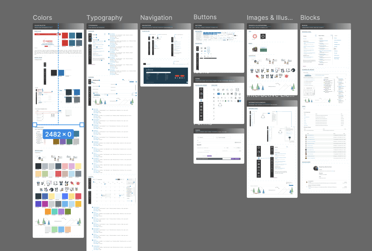
With our design principles defined and our system aptly named Palette, we set out to build it in Figma, starting with the foundational components—colors, typography, spacing, and icons.
These essentials tackled the inconsistencies and design flaws in the Canvas website, establishing a cohesive framework that streamlined the experience, reduced redundancy, and brought clarity and unity to the platform. Palette became the foundation for a more intuitive and user-focused interface.
We got rid of 70% of colors that looked same.
While deconstructing the website, we discovered an overwhelming number of shade variations for single colors, which quickly became a source of frustration.
To address this, we streamlined the palette by selecting a single, accessible shade for each color style, ensuring it met WCAG guidelines. This not only simplified the design but also brought clarity and consistency to the system.
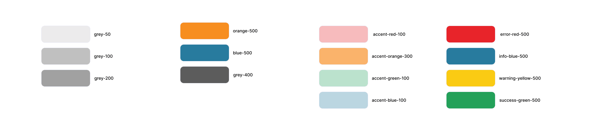
We also streamlined color system: categorised and purpose-driven.
• Primary and Secondary Categories: Organized for clear hierarchy and functionality.
• Defined Functional Roles: Includes action, text, danger, and background colors to ensure purposeful and consistent use.

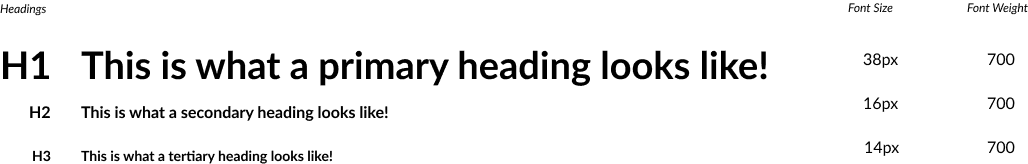
Next, we streamlined the text styles to create a cohesive and visually appealing typographic system that reinforces clear hierarchy and readability.
By standardizing font sizes, weights, and line heights, we established a strong visual and text hierarchy, ensuring that users can easily distinguish between headings, subheadings, body text, and other content. This refinement not only enhances the user experience but also brings consistency and professionalism to the overall design.

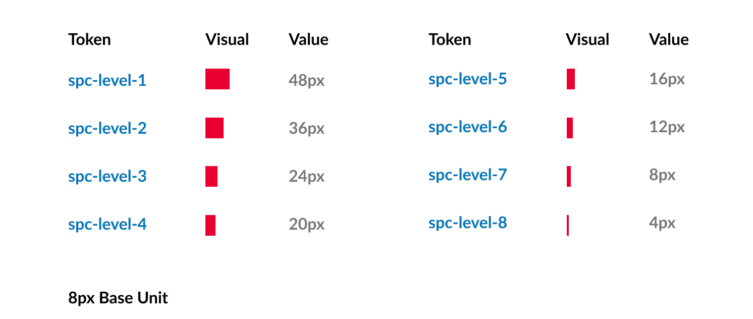
Just as we refined the text styles and color system, we also tackled the spacing hierarchy and grid structure to bring consistency and order to the design.
We established a 12-column grid system as the foundation for layout alignment, ensuring flexibility and visual balance across all screens.

Additionally, we introduced a standardised spacing system, dividing sections into four levels of spacing based on an 8px base unit.
This approach not only simplified the design process but also ensured a harmonious hierarchy and a scalable structure, creating a more intuitive and cohesive user experience.

Furthermore, we brought all the foundational elements together by applying them to key interactive components, such as buttons and icons.
For buttons, we created a comprehensive set of components for each button style, including variations for size, state (default, hover, active), and function (primary, secondary, etc.). Each button was meticulously aligned with the established color, typography, and spacing foundations, ensuring consistency and accessibility throughout the system.

When creating the button components, we focused on adding customisable properties to make them easily adaptable and seamlessly integrate into any design.
By incorporating options for size, color, state variations, and more, we ensured that these buttons could be effortlessly tailored to fit different contexts and design needs, all while maintaining consistency and functionality across the system.

For icons, we standardised their size, placement, and alignment to integrate seamlessly with the overall design.
By building these components on the foundations we had established, we created reusable and scalable elements that not only enhanced functionality but also maintained visual harmony across the platform. This final step ensured that the design system was both robust and ready to deliver a polished, cohesive user experience.


Lastly, we tested our UI kit with other designers to ensure it functioned as intended.
We published it on the Figma Community and asked our classmates to recreate pages from the Canvas platform using the kit. Each testing session lasted around 10-15 minutes, and we quickly discovered that the kit needed significant adjustments.
Many components were missing, and others were disorganised or poorly labeled, making them difficult to access and use effectively. This disorganization led to spacing issues on the recreated pages, revealing that the kit wasn’t as seamless as we had hoped. These insights highlighted the need for further refinement and improvement to make the system truly user-friendly and efficient.
The testing sessions revealed key shortcomings in our UI kit, and we made significant improvements based on the valuable feedback we received.
This allowed us to refine the kit, address issues, and enhance its usability for a more streamlined design experience.
To document our design system, we chose Zeroheight, an intuitive online platform specifically built for hosting and managing design system documentation.
Zeroheight allowed us to create a well-organized, accessible space where all aspects of our system—from UI components to design guidelines—could be clearly outlined and easily referenced. This streamlined the documentation process, ensuring that our system could be efficiently shared, updated, and maintained, making it an invaluable resource for future collaboration and implementation.
We organized our documentation into four key sections: Get Started, Style, Components, and Resources, ensuring a clear and structured flow.

Get Started
The “Get Started” section includes an overview, guiding principles, and contribution guidelines. Here, you’ll find links to our Figma UI kit, definitions for the Palette design system, and a detailed explanation of our core principles. Additionally, we’ve provided a link to join our Discord channel, offering an open space for feedback and collaboration. This structure ensures users can easily navigate and engage with the system, fostering a collaborative and accessible environment.

Style
The "Style" section outlines our four core foundations: Colors, Typography, Iconography, and Layout. Each section is carefully defined with clear guidelines on how to seamlessly integrate these elements into your website. From color usage to typography choices, icon design, and layout structure, we provide practical instructions to ensure consistency and visual harmony throughout your design. This section also includes WCAG accessibilty guidelines for each core foundation.

Components
The "Components" section is your complete toolkit for recreating the Canvas website. It includes all the essential UI elements—cards, buttons, links, pagination, accordions, popups, tabs, radio buttons, tooltips, modals, dropdowns, tables, toggles, and breadcrumbs. With these core components, you can easily build any page from the Canvas platform. Each component is thoroughly detailed, explaining its usage, variations, states (such as for buttons), and WCAG accessibility guidelines to ensure both functionality and inclusivity.

Resources
The "Resources" section is designed to offer users support and guidance whenever needed. Whether you’re feeling lost or need to get in touch with the Canvas team, this section provides all the help you need. It includes direct links to our Discord channel for real-time feedback and a dedicated email address for reaching out to the Canvas team, ensuring seamless communication and ongoing support.

Canvas currently lacks a comprehensive design system, and adopting Palette would not only enhance the website’s appearance and usability but also set a benchmark for other edtech platforms. By implementing this system, Canvas could encourage the wider industry to adopt their own design frameworks.
Additionally, Palette would save the Canvas team significant time and effort in maintaining consistency across its vast number of pages, making the design process more efficient and less time-consuming.
The core principles of the Palette design system are a key reason to adopt it:
Consistency
Modularity
Simplicity
Accessibility
We’ll explore these principles in detail during the ‘Define’ phase—but first, let’s rewind and see how it all began.
Creating a design system for the first time in my UX career initially seemed straightforward, but it quickly became challenging as I delved deeper. This process was incredibly valuable and helped me grow in several key areas:
• Enhanced Design Thinking:
I gained a deeper understanding of how to structure and approach design in a more cohesive way.
• Improved Figma Skills:
My proficiency in Figma significantly increased as I worked with complex components and systems.
• Learned Zeroheight:
I mastered a new tool, Zeroheight, which was essential for documenting the design system.
• Collaboration Skills:
I realized the importance of effective collaboration, especially when creating something as foundational as a design system. Working closely with my team was crucial for success.
• Shifted My Design Approach:
This experience completely transformed how I approach UX design, and I’m eager to apply these new skills in future projects.
If we had more time:
I would have conducted further testing and made additional improvements to perfect the system. I’d also consider expanding the design system to include the Canvas mobile app, ensuring consistency across platforms.
